On the Home Front

As the creative force behind international furniture brand DEDON and with a rich experience in designing spaces, Hervé and Tess Lampert welcomes us to their latest collaboration—a chic city home in the oasis that is 32 Sanson by Rockwell.
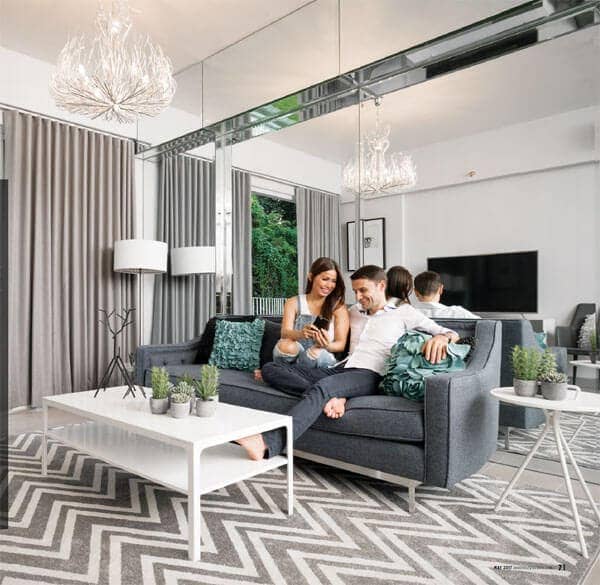
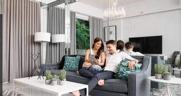
The living room’s relaxed and spacious feel make it a great space to relax and connect with family, as Hervé and Tess do here.
Dressed in a white peasant top and high waisted flared jeans, Tess Lampert is the gracious host as she ushers us into their new family home at 32 Sanson by Rockwell. At the moment, she explains, her husband Hervé is going through the rooms of the two-bedroom unit with the workmen, taking note of any additional work or finishing that needed to be addressed. “It’s a little hectic,” she explains, sharing that she had bought additional accents for the home that very morning. “The unit is still really a work in progress.”
Of course, it’s completely understandable that some final aspects of the project might have gotten left behind—since the unit was turned over in January, the couple had been flying regularly between Cebu and Europe. Thankfully, the couple’s strong background in design means they had a vision for the space that made decorating it seem almost natural. As the managing partner of DEDON, Hervé is savvy to the world of sophisticated furniture design, while Tess has had a strong hand in designing many of the family’s personal spaces and the ultra-chic DEDON Island Resort in Siargao. “I think this is my sixth time working on interiors,” Tess shares, naming the different properties the couple had acquired over the years. “This time, it was a lot easier, especially when I saw how 32 Sanson had come alive this past year. I can’t really say how much French, German or Filipino sensibilities came into play in this unit, but I must say a lot of it was inspired by Rockwell’s style.”

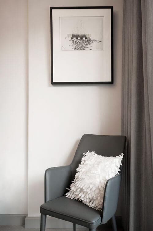
Metal stick figures of animals are a modern take on traditional tabletop still life; framed artwork from Pottery Barn hang in different corners of the house, all of which follow a black-white-gray palette.
That’s certainly true—the experience of visiting the Lampert’s new unit really begins with walking down the landscaped paths under 32 Sanson’s completed Gmelina tower, its sleek and modern façade softened by lush greenery. Glass double doors lead into the lobby, which was created by Rockwell’s regular collaborator Butch Valdez. An oversized painting anchors a casual sitting area, dictating the color palette of rich oranges and earth tones.
The colors become a more subdued composition of blue and gray as you make your way into the hallway that leads to the unit, something that Tess further employs into their own space—being the first unit from the entrance, the seamless transition from the public areas into the private makes their home feel more spacious than it already is. A mirrored wall that runs the length of the unit’s living areas further enhances the feeling of airiness, as does the three meter ceiling height. Gray, deep blue and white furniture is a sophisticated way to add details while avoiding
the visual clutter. “I had just finished dressing up our Saint-Paul-De-Vince home,” Tess shares, referring to their family home in the French Riviera. “I think I still have a bit of a hangover from the French gray colors.”
“I can’t really say how much French, German or Filipino sensibilities came into play in this unit, but I must say a lot of it was inspired by Rockwell’s style.” -Tess
Aside from picking up on tones from Rockwell’s own color palette, Tess used a painting she had found at Pottery Barn in Manila as inspiration. The abstract watercolor has various shades of gray that fades in subtle oranges. “My rule of thumb, whether in cooking or designing interiors, is to gather materials first. In cooking, that my ingredients; in designing, it’s the furniture,” she reveals. “Having this strategy cuts your stress in half—you don’t have to spend so much time trying to find the pieces that match your plan. It’s especially useful when you’re living somewhere like Cebu, where options and sources can be limited.”
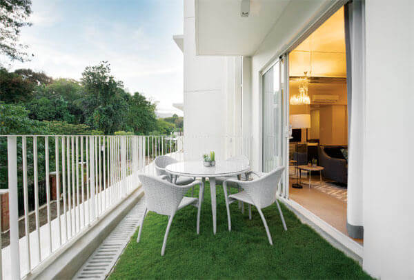
Complementing the city oasis theme of 32 Sanson, the unit enjoys a large grassy patio that blends seamlessly into the foliage outdoors. A DEDON dining set invites the residents and their guests to spend more time outside.
“My rule of thumb, whether in cooking or designing interiors, is to gather materials first. In cooking, that’s my ingredients; in designing, it’s the furniture. Having this strategy cuts your stress in half—you don’t have to spend so much time trying to find the pieces that match your plan.” -Tess
The rest of the living room is kept minimal. A glass-topped round table completes the dining area, while a graphic rug is a soft dividing feature that defines the TV area. A sofa from Dimensione is the focal point, with pieces like the Scandinavian-inspired side and coffee tables complementing the clean and contemporary feel. Personality comes into play with interesting lighting fixtures, such as the chandelier from Ilaw Atbp. in A.S. Fortuna. A console table stands across the sofa, and is one of Tess’ favorite pieces in the home. “It’s from Ito Kish,” she explains. “I just fell in love with the color—how it has shades of white and gray. I also really like its nod to modernism.” Potted greens from Our Home give the room a breath of life, and mimics the greenery of the outdoors revealed by the large sliding glass doors.
The terrace almost runs the entire length of the unit, which allows the residents to enjoy the lushness of the trees and creek behind the property. Right now, a round outdoor table from DEDON stands atop the bright grassy space, although Hervé admits this might see a lot more changes in the future. “We have a lot of outdoor furniture,” he says with a laugh, referring of course to DEDON’s extensive collection. “We might put in some lounge chairs here, so we can entertain more outside.”
That’s not to say, though, the couple had been entertaining a lot recently. Because they had just moved in, the home hasn’t seen too many guests. “But family and friends who have seen it tell us that they love everything about it,” Tess adds.
There was certainly a sophisticated but approachable charm that permeated throughout the home. The bedrooms feature upholstered headboards, made less formal with cool gray hues and lighter-colored linens. Key pieces like mirrored drawers and a sleek secretary added to the space without creating clutter.
One of the most charming features in the home, though, are the bathrooms, which were filled completely with shiny mosaic tiles in different shades of gray. “They’re just from Cebu Home Builders,” Tess says about where they had gotten the tiles. “Hervé was wondering if it was a bit too much, but we love how it ended up looking. It still feels cozy, but with a lot of style.”
“It’s all about the feel. The design aesthetic of the space has to create an atmosphere and energy that you like being around in. That’s what transforms a house into a home.” -Tess
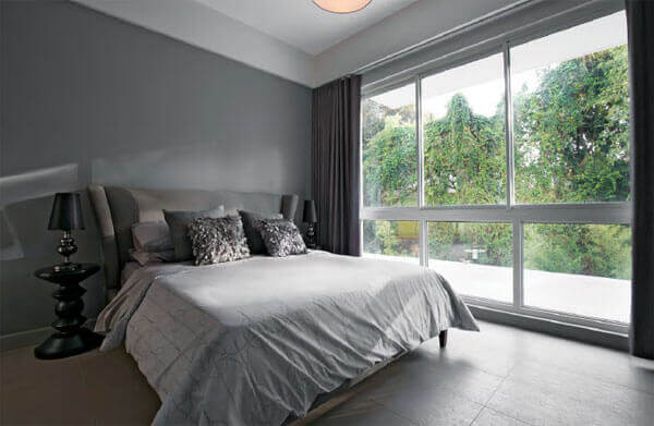

Matching the headboard to the walls create a seamless look in the bedroom, while the picture windows bring in a splash of green to brighten up the space; the master’s bath features walls that are covered completely in shiny mosaic tiles that Tess found at Cebu Home Builders, creating a sophisticated look; mismatched pillowcases and linens keep the bedrooms from looking too formal, and makes the space feel more lived in.
The home is clearly a collaborative effort between Hervé and Tess, and it’s lucky they have the taste and know-how that allowed them to really create a space that reflected the life they wanted to live. “There were some negotiations, but at least our preferences weren’t too different from each other,” Tess admits with a laugh.
At the end of the day, how the 32 Sanson unit came together shows off how well Tess and Hervé collaborate in life and on spaces. By bringing together their tastes and working with the pieces available to them, the couple was able to create a homey but chic residence that works for their lifestyle. That, Tess feels, is something that’s particularly important. “It’s all about the feel,” she shares. “The design aesthetic of the space has to create an atmosphere and energy that you like being around in. That’s what transforms a house into a home.”
As published in Zee Lifestyle Magazine on May 2017 issue. Written by Shari Quimbo. Photography by Oliver Echevarria. Hair and Makeup by Janice Barillo.

 Cebu 0917 599 ROCK (7625)
  inquire@rockwell.com.ph


Leave a Reply
Want to join the discussion?Feel free to contribute!